

In Odoo 17, customizing the appearance of UI elements can enhance the user experience and provide better visual feedback from the end users. One such element is the progress bar, which displays the status of various processes.
By changing the color of a progress bar according to its level of completion, the user can easily understand the completion of the task. In this tutorial, we will go through how to change the color on a progress bar in Odoo 17.
Table of Contents
Step 1: Modify the XML File
Firstly, add a progress bar in your desired form view. We added a progress bar to the res.partner form view in the example below. To achieve this, we need to create or update the res_partner.xml file.
Here’s the XML code to include the progress bar:
<?xml version="1.0" encoding="utf-8"?>
<odoo>
    <data>
        <record id="view_partner_base_vat_form" model="ir.ui.view">
            <field name="model">res.partner</field>
            <field name="name">view.partner.base.vat.form</field>
            <field name="inherit_id" ref="base.view_partner_form"/>
            <field name="arch" type="xml">
                <xpath expr="//field[@name='vat']" position="after">
                    <field name="progress" widget="progressbar"/>
                </xpath>
            </field>
        </record>
    </data>
</odoo>Here we inherit the base partner form view and add a progress bar field after the VAT field. The progress bar will appear in the partner form in the res.partner model.
Step 2: Extend the Progress Bar in OWL JavaScript
We already added a progress bar widget in step one. The next step is to extend the existing progress bar color based on its completion percentage. We have to update or create an OWL JavaScript file, progress_bar.js.
See below the JavaScript Code for how to change the color on a progress Bar in Odoo 17
/** @odoo-module **/
import { progressBarField, ProgressBarField } from "@web/views/fields/progress_bar/progress_bar_field";
import { patch } from "@web/core/utils/patch";
patch(ProgressBarField.prototype, {
    setup() {
        super.setup(...arguments);
        // Additional setup if needed
    },
    get progressBarColorClass() {
        // Change the Color on a Progress Bar in Odoo 17
        const widthComplete = this.currentValue;
        if (widthComplete > 0 && widthComplete <= 40) {
            return "o_progress_red";
        } else if (widthComplete > 40 && widthComplete <= 70) {
            return "o_progress_yellow";
        } else if (widthComplete > 70 && widthComplete <= 90) {
            return "o_progress_light_green";
        } else if (widthComplete > 90 && widthComplete <= 100) {
            return "o_progress_green";
        }
        return "bg-primary";
    }
});Here we are using the path utility to extend the ProgressBarField class. The progressBarColorClass function assigns a color class according to the value of the current progress. This method returns different CSS class names depending on the progress percentage.
Step 3: Define the CSS Classes
Now we have to define the color of the progress bar, so we need to define custom CSS classes. These classes will style the progress bar based on the value returned by the progressBarColorClass method.
Create a file progress_bar.css file with the following content:
.o_progress_red {
    background-color: red !important;
}
.o_progress_yellow {
    background-color: yellow !important;
}
.o_progress_light_green {
    background-color: lightgreen !important;
}
.o_progress_green {
    background-color: green !important;
}The above CSS classes define the background colors for different ranges of the progress bar’s completion percentage. We used !important to override any default styles.
Step 4: Load the CSS and JS Files
Add these files to your __manifesr__.py file with ‘assets’. Here is an example of how to update the __manifesr__.py file:
{
    'name': 'Your Module Name',
    'version': '17.0.1.0.0',
    'category': 'Category',
    'summary': 'Summary',
    'description': 'Description',
    'depends': ['base'],
    'data': [
        'views/res_partner.xml',
    ],
    'assets': {
        'web.assets_backend': [
            'your_module_name/static/src/js/progress_bar.js',
            'your_module_name/static/src/css/progress_bar.css',
        ],
    },
    'installable': True,
    'application': False,
}In this manifest file, the data section includes the XML file, and the assets section provides the path of JS and CSS files to load when the Odoo backend is initialized.
Explanation of OWL JS Logic
The JavaScript logic is at the heart of this customization. Let’s examine the progressBarColorClass method in more detail.
Using the progress bar’s currentValue attribute, the progressBarColorClass method determines the relevant CSS class. This property shows the progress bar’s completion percentage. The reasoning is broken out as follows:
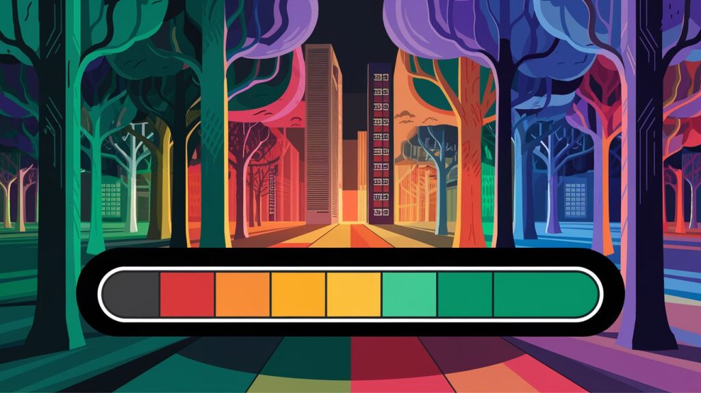
If currentValue is greater than o and less than or equal to 40, the method returns the CSS class o_progress_red, which makes the progress bar red.
The method returns the CSS class o_progress_yellow, which colors the progress bar yellow if currentValue is greater than 40 and less than or equal to 70.
To make the progress bar light green, the method returns the CSS class o_progress_light_green if currentValue is greater than 70 and less than or equal to 90.
The method returns the CSS class o_progress_green, which colors the progress bar green if currentValue is greater than 90 and less than or equal to 100.
The procedure uses the default Bootstrap main color, bg-primary class if the currentValue does not fall into any of these ranges.
Odoo will automatically apply these adjustments when producing the progress bar after the logic and styles have been defined. The progress bar will dynamically change color to indicate the completion state as users interact with the form and the progress value changes.
Bonus Tips for Better UX
- Use tooltips: Add percentage as a tooltip so users can hover and see exact values.
- Keep contrast in mind: Make sure your color stands out against the background.
- Use animations: Smooth width transitions make your UI feel modern.
- Avoid too many colors: Stick to 2–3 for consistency.
- Test on dark/light themes: Ensure readability on both modes.
Related Post:
>> What is Odoo OWL JS Framework? An Odoo’s Front-End Framework
>>How to Create Gantt View in Odoo 17
Conclusion on Changing the Color of a Progress Bar in Odoo 17
You can customize the color of Odoo 17’s progress bars based on their completion levels by following these steps. Users can now rapidly evaluate the progress of different tasks and processes thanks to this improvement, which also makes the user interface more aesthetically pleasing and straightforward.
Improving UI components like the progress bar can significantly improve productivity and user experience. I hope you like this blog post on how to change the color on a progress bar in Odoo 17
Still, have doubts? Feel free to reach out through the comment section.
Happy Coding!

